
Visualize and compare fusion results of multiple analyses with heatmaps
With heatmap visualizations, you can see the presence or absence of fusions in your samples, and you can compare the fusion calls across multiple analyses.

Follow these steps to visualize analysis results of multiple fusion analyses:
In the Analyses Overview screen, enable the checkboxes of the analyses that contain the results you want to visualize.

In the Action menu on the right, click the Visualize option.
Note: The Visualize menu option is only available when you select more than one analysis.
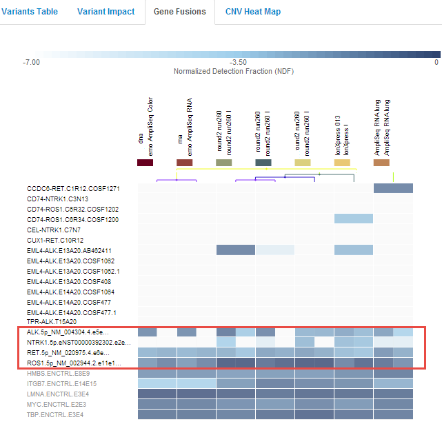
In the Analysis Visualization page, click the Gene Fusions tab.
Notes about heatmap visualizations:
Interpret each cell according to the color scale above the chart. The strongest fusion calls are indicated with the darker color as shown in the color scale.
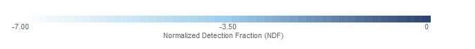
- Normalized Detection Fraction (NDF) values are calculated as follows (for a fusion F in sample S):
log10((read count of F) / (total read count in S)) Each fusion isoforms that is included in the Ion AmpliSeq™ Panel is listed in the Details pane.
For fusions heat maps, NDF is used as the score for every fusion-sample pair to generate the heat map. Thereafter, hierarchical clustering is conducted for clustering fusions and samples within the heat map.
By default, expression control and ASSAY_5P_3P calls are listed close to the bottom of the chart.
Click the Filter Options menu to change the order of the fusions. You can order the chart by:
Fusion ID
5' name
3' name
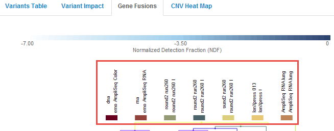
Each sample is listed at the top of the Gene Fusions tab.
Click the Sample Order menu to change the order of the fusions. You can order the chart by:
Name—Samples are listed alphabetically by name.
Similarity—Sorts by similarity of the samples that are in the fusion calls made, in order from the fewest fusions to the most numerous fusions.
Similarity (reversed)—Sorts by similarity of the samples that are in the fusion calls made, in order the most numerous fusions to the fewest fusions.
Analysis—The list of analysis is sorted alphabetically by analysis name.
Samples are also listed below the Chart Options.
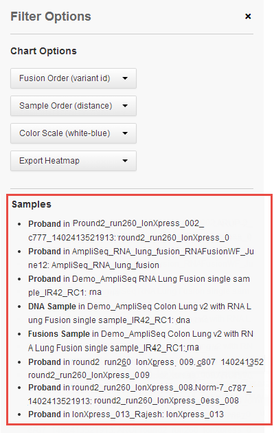
Click Selected Analyses to see the list of analyses in the heatmap.
You can change the order of the color scheme used in the chart with the Color Scale menu.
White or blank cells indicate no reads (in the default color scheme). Many cells in the example heatmap show no reads. With red-green and red-blue color schemes, red indicates a no-reads cell.
Click Export Heatmap to export a heatmap as an image or as a comma-separated text file.
Supported export formats are:
PNG—Portable Network Graphics format
SVG—Scalable Vector graphics format
CSV—A comma-separated text file, readable by spreadsheet programs or as a text file